Component
-
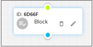
Component Block
- Organizing Large Bots - Helps manage and structure complex bots by breaking them into smaller, reusable components.
- Multi-Step Processes - Useful for handling multi-step workflows such as user verification, order tracking, or customer support.
- Reusable Flows - Common interactions like FAQs, payment processes, or appointment scheduling can be stored as separate blocks and reused across the bot.
- Team Collaboration - Different teams can work on separate blocks without interfering with the entire bot structure.
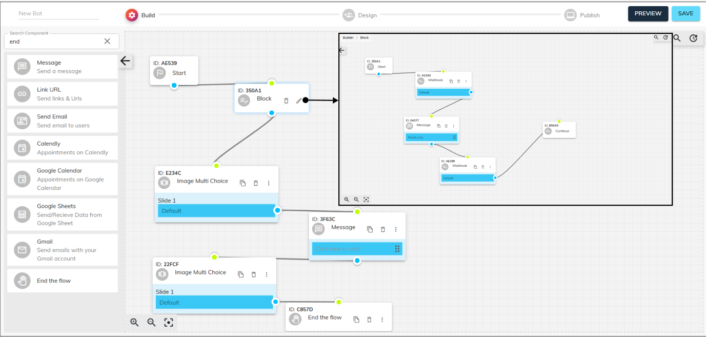
- Purpose - Encapsulate a self‑contained sub‑flow—think of it as a “mini‑bot” within your main bot—to keep complex conversations organized, modular, and easy to maintain.
- Large‑scale bots: Break sprawling conversational designs into bite‑sized, reusable blocks.
- Multi‑step journeys: Encapsulate processes like KYC verification or order tracking into standalone units.
- Reusable scripts: Store common sequences (e.g. FAQs, payment steps) once, then drop them into any flow.
- Team collaboration: Different users can work on different blocks independently without stepping on each other’s toes.
The Component Block plays a crucial role in organizing larger bots, ensuring a clean and functional bot-building experience. By grouping different flows into a single block, it simplifies the bot structure, making it easier to manage and navigate. This approach enhances efficiency, as future modifications can be made within specific components without affecting the entire bot. Additionally, it keeps the bot builder interface clutter-free, ensuring a smooth workflow while maintaining clarity and scalability in complex bot designs.
Use Cases:
How it helps:
A financial‑services chatbot has one block for “Account Opening,” another for “Loan Eligibility,” and yet another for “Customer Feedback.” Each can be updated or tested separately without touching the others.
-
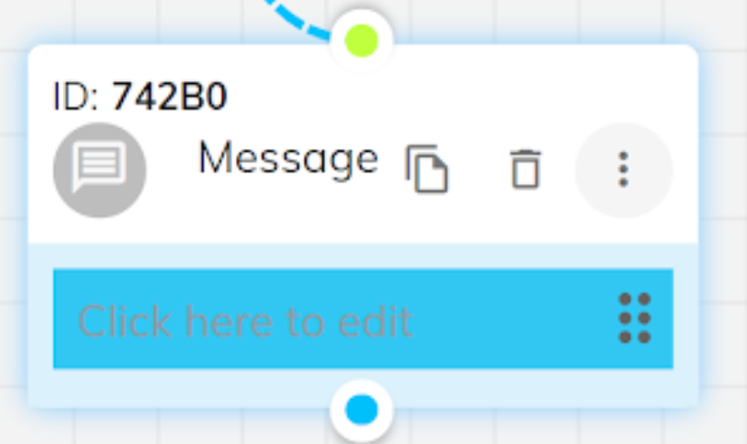
Message Component:
- What it does: Delivers a static text prompt.
- When to use: Any time you need the bot to say something—welcome greetings, instructions, confirmations.
- Example: “Welcome to Acme Bank! How can I assist you today?”
The Message component can be used to display a simple message to the user.
So, if you want your chatbot to state a particular statement or message to your end user, you can use this component.
After clicking the ⋮ icon on the component, you get this pop-up window where you can edit the component contents, as you can see in the screenshot below, you can type your custom message in the textbox and then click the save button in the bottom, and your component will be ready to use!
-
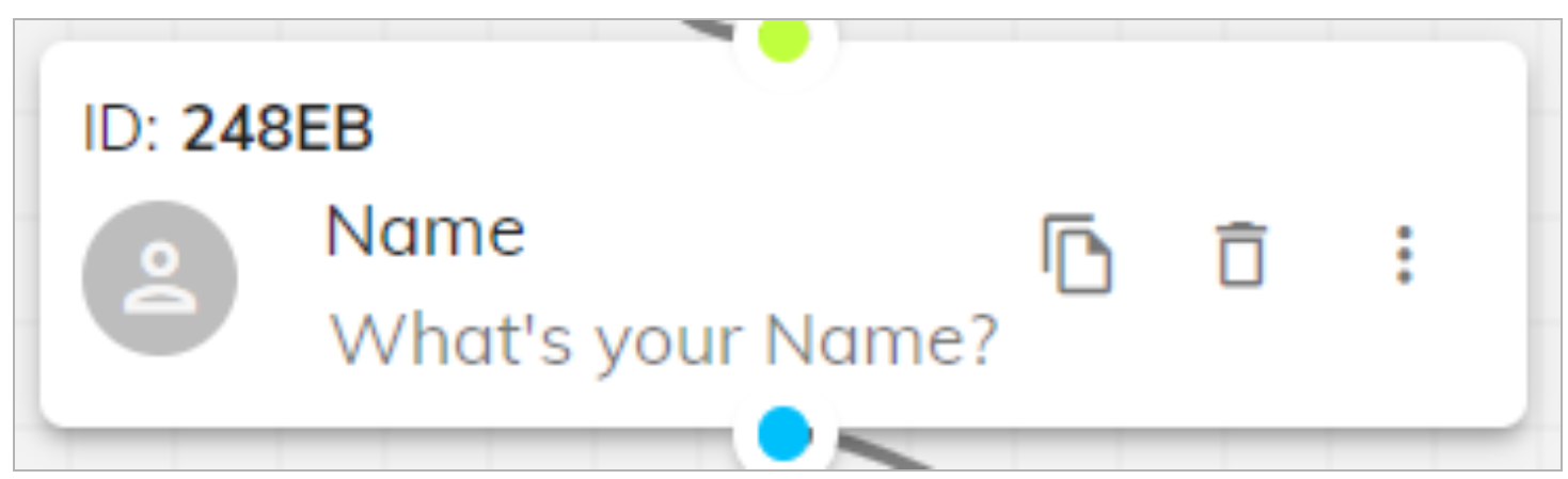
Name Component:
- What they do: Collect the user’s name, phone number, or email address, with built‑in validation and customizable error messages.
- Use Case: Onboarding flows that need to capture lead details for follow‑up.
The Name component takes the Name of your end user as its input. There are also customization options in it, if you want to take the user’s first name as the only input, you can change the component setting accordingly by clicking the ⋮ icon on the component, and you can also display custom error messages if the user enters something different than the required name. The name component can also be stored as a lead.
-
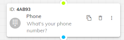
Phone Component:
- What they do: Collect the user’s name, phone number, or email address, with built‑in validation and customizable error messages.
- Use Case: Onboarding flows that need to capture lead details for follow‑up.
The Phone component takes the phone number as input from the end user. If the user enters something other than a number, the chatbot prompts the user immediately, the error message can be customised by clicking on the ⋮ icon on the component. The phone component can also be stored as a lead.
-
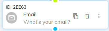
Email Component:
- What they do: Collect the user’s name, phone number, or email address, with built‑in validation and customizable error messages.
- Use Case: Onboarding flows that need to capture lead details for follow‑up.
The Email component takes the email as input from the end user. If the user enters something other than an email, the chatbot prompts the user immediately and you can put a custom error message or change the component settings accordingly by clicking the ⋮ icon on the component window. The email component can also be stored as a lead.
-
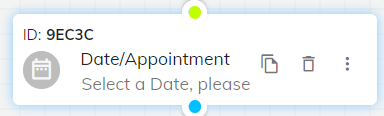
Date/Appointment Component:
- What they do: Ask users to pick calendar dates or times, and optionally block out unavailable slots.
- Use Case: Scheduling service calls or booking demo appointments directly within chat.
The Date/Appointment component asks the end user to select the required date. The user can also use it to schedule an appointment. The component offers customization to block certain days that cannot be scheduled for an appointment by clicking on the ⋮ icon on the component window.
-
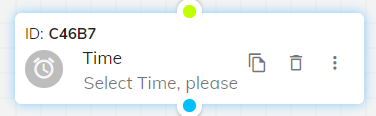
Time Component:
- What they do: Ask users to pick calendar dates or times, and optionally block out unavailable slots.
- Use Case: Scheduling service calls or booking demo appointments directly within chat.
The Time component asks the end user to select the time for the scheduled or to schedule an appointment. The component offers customization to block certain time slots which cannot be scheduled for an appointment by clicking on the ⋮ icon on the component window.
-
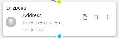
Address Component:
- What it does: Captures a free‑form address.
- Use Case: Last‑mile delivery bots asking for drop‑off locations.
The address component asks the user for the address. The address can be stored in the form of a lead and also can be stored in the form of a variable inside the chatbot, which can be called further in the chatbot flow by connecting the blue dot with the green dot, also you can edit component settings or customise messages by clicking the ⋮ icon on the component window.
-
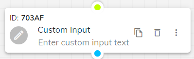
Custom Input Component:
- What it does: Accepts any arbitrary text without predefined validation rules.
- Use Case: Collecting open‑ended feedback or clarifications.
The Custom Input component asks the end user for custom input. The chatbot can take any random information through this component. This component is generally used to ask a specific question to the end user, and it does not have a predefined rule in terms of the type of input it can take. The settings or questions can be edited by clicking the ⋮ icon on the component window.
-
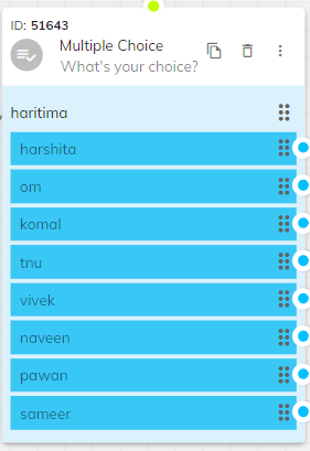
Multiple Choice Component:
- Allows: Selecting one option from a custom list you define.
- Use Case: Letting users pick from “Checking,” “Savings,” or “Credit Card.”
The Multiple Choice component asks the end user to choose multiple choices. By using this component, you can give your user multiple options to choose from. You need to specify the different options by clicking the ⋮ icon on the component window, and you can manage the rest of the flow of the chatbot depending on the option the user has chosen. You can also choose different UI styles.
-
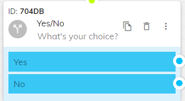
Yes/No Component:
- Allows: Simple binary decisions without extra configuration.
- Use Case: “Would you like to receive SMS alerts? Yes or No.”
The Yes/No component asks the end user to select an alternative between Yes and No. By using this component, you can give your user options to choose from. You don’t need to specify the different options, but you do need to set the statement in which the user answers Yes/No by clicking on the ⋮ icon on the component window, and you can manage the rest of the flow of the chatbot depending on the option the user has chosen.
-
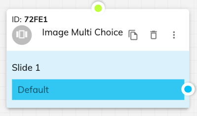
Image Multi Choice Component
- Easily upload and arrange images.
- Specify corresponding choices and actions based on user selection.
- Choose different UI styles for displaying the options to match your brand's aesthetic.
The Image Multi Choice component is designed to enhance user engagement by allowing them to make selections from a set of images. This interactive component is particularly useful for visually representing choices, such as product options, services, or any scenario where images provide better clarity than text alone. Users can browse through images and select their preferred option, making the interaction more intuitive and engaging.
Usage: Ideal for showcasing products, services, or visual options.
Customization:
Allows: Visual selection from a carousel of images.
Use Case: E‑commerce bots showcasing three product images and letting the user tap to choose.
-
Ticket Component
- Configure the component to capture necessary user information and conversation context.
- Ensure seamless integration with your support system for efficient ticket management.
- Customise the ticket creation flow to match your support processes.
- What it does: Creates a support ticket directly from the chat, capturing context and user data for your helpdesk.
- Use Case: E‑commerce returns: user reports a damaged item; a ticket is auto‑created for follow‑up.
The Ticket component is an essential tool for issue tracking and resolution within your chatbot. It allows users to create support tickets during their chat session, ensuring that any issues they encounter are promptly addressed. This component captures the conversation context and relevant user data, which helps the support team resolve issues more efficiently.
Usage: Facilitates support ticket creation and issue resolution.
Customization:
-
Multi Select Component:
- Allows: Picking multiple items from a list.
- Use Case: Surveys where respondents can choose all applicable interests.
The Multi Select component asks the end user to select multiple choices. If you want your user to choose various options, this is your go-to component. For example- if you are conducting a survey and there’s a possibility that for the question you’ve asked, the user can agree with multiple options. For that information, this component comes in handy, you can change the settings and put in customised messages by clicking the ⋮ icon on the component window. There is no different flow for each option that you’ve selected.
-
Media Display Component
- Upload and display a variety of media types, including images, videos, and audio files.
- Customise the display settings to fit your chatbot's design and user experience goals.
- Use multimedia content to provide comprehensive explanations and enhance user understanding.
- What it does: Shows images, videos, or audio clips inline.
- Use Case: Product demo videos or how‑to guides.
The Media Display component enriches the chat experience by allowing the integration of multimedia content, including images, videos, and audio files. This component can be used to provide visual or auditory assistance, enhancing the user's understanding and engagement. Whether it's a product demonstration video, an informational audio clip, or an illustrative image, the Media Display component makes it easy to incorporate rich media into your chatbot interactions.
Usage: Enhance user engagement with multimedia content.
Customization:
-
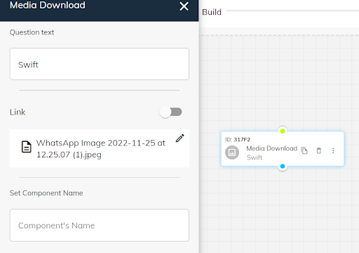
Media Download Component:
- What it does: Offers a button for the user to download a file.
- Use Case: Delivering an invoice PDF or price list.
The Media Download component asks the end user to download the media. If you want the user to download the particular media that you are enclosing into the chatbot, this is a useful component for you. You can customise the settings and insert media by clicking on the ⋮ icon on the component window.
-
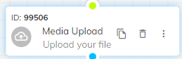
Media Upload Component
- What it does: Lets users upload documents or images back to your system.
- Use Case: ID verification by uploading a driver’s license photo.
The Media upload component asks the end user to upload the media. If you want a media file (can be a document, identity proof, etc.) particularly from the user using the chatbot, you can ask them to upload it using this component onto your chatbot. For example- if you want your user to enclose an invoice or photo while conversing with the chatbot for a particular reason, this is your go to component. It supports images, videos, GIFs, and pdfs.
-
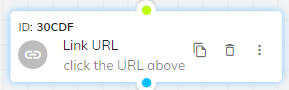
Link URL Component
The Link URL component prompts the user to click on the specified link that will be provided to the user in the chat, you have to click on the ⋮ icon on the component that will open a pop-up window in which you can enter the link that you want the user to click on and the Link URL component will display that link to the user using the chatbot.
-
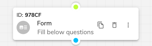
Form Component
- Form Fields: Click the ⋮ icon on the component to design and arrange form fields according to your requirements.
- Error Messages and Validation: Customise error messages and input validation to ensure the accuracy and completeness of the information provided.
- Appearance: Adjust the appearance of the form to align with your brand's visual style, creating a seamless user experience.
- What it does: Presents a mini‑form with multiple fields (text, dropdowns, checkboxes).
- Use Case: Customer satisfaction surveys or event registrations.
The Form component collects detailed information from users through a series of input fields, ensuring data is gathered in a structured and organised manner. This component is ideal for applications such as surveys, registrations, feedback collection, or any scenario requiring user input. It supports a variety of field types, including text, dropdowns, checkboxes, and more, allowing for comprehensive data capture.
Usage: Capture detailed information from users.
Customization:
-
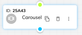
Carousel Component
- Add and arrange items within the carousel to highlight key offerings.
- Customise the appearance of the carousel to match your brand's visual style.
- Enable users to interact with items directly from the chat, driving engagement and conversions.
- What it does: Horizontally scrollable cards—ideal for product catalogs or step‑by‑step tutorials.
- Use Case: Displaying menu items in a food‑ordering bot.
The Carousel component presents multiple items or options in a horizontal slide-through format, allowing users to browse through a series of items in a visually appealing way. This component is perfect for showcasing products, services, articles, or any other items that can benefit from a rich visual display. Users can easily swipe through the carousel and select items, making the browsing experience more interactive and enjoyable.
Usage: Showcase multiple items in an engaging format.
Customization:
-
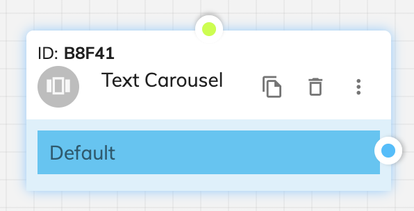
Text Carousel Component
- Button Types:
- CTA Button: Add a label and URL to redirect users to an external website or page.
- Quick Reply Button: Configure replies that trigger specific steps or actions in the bot flow, enabling dynamic progression.
- Flow Connectivity:
- User Experience:
The Text Carousel component allows you to display a scrollable set of text content cards, each with configurable buttons, offering an interactive and informative experience for users.
Usage: Use this to showcase multiple text items, features, or choices in a single view that users can swipe through.
Access Customization: Click the ⋮ icon on the component.
Card Content: Configure each card with a title, description, and an optional image to provide relevant context or information.
Assign each carousel card to a follow-up action or redirection to maintain engagement and streamline interaction.
Designed to enhance discoverability and choice without overwhelming the user, ideal for product carousels, FAQs, onboarding options, and more.
-
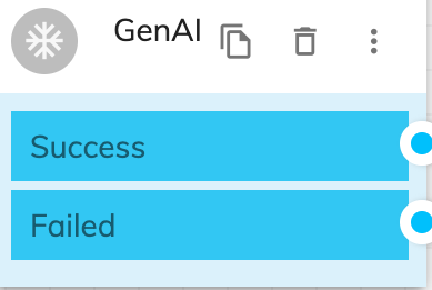
GenAI Component
- What it does: Hooks into different LLMs (general LLM, GPT‑3.5, or a hybrid). Choose based on the complexity and style of responses you need.
- Use Case: Free‑form customer support where nuanced, context‑aware language generation is critical.
The GenAI component elevates the conversational AI experience by offering integration with different language models. Users can customise their chatbot’s response generation according to the desired complexity and style by selecting from the following model options:
LLM (Large Language Model): Utilise the robust capabilities of a general Large Language Model for a broad range of topics and conversational contexts. This option is suitable for diverse interaction scenarios, providing reliable and comprehensive responses.
GPT-3.5: Opt for GPT-3.5 to harness an advanced AI language model renowned for its nuanced understanding and generation of human-like text. This option is ideal for creating conversations that require a deep understanding of context and subtleties in various domains.
LLM in GPT-3.5: Combine the strengths of a general LLM with the specific advancements of GPT-3.5. This hybrid approach allows the bot to handle a wide array of queries while benefiting from the refined conversational abilities of GPT-3.5, particularly effective for specialised interactions.
-
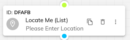
Locate Me Component
- Configure the component to retrieve and display relevant locations based on the user's position.
- Choose between list view or map view with interactive pins for displaying locations.
- Customise the appearance and functionality to enhance user experience and accessibility.
- What it does: Detects user location and shows nearby points of interest on a map or list.
- Use Case: “Find nearest branch” in a banking chatbot.
The Locate Me component provides a powerful way to help users find nearby locations or services based on their geographical position. This component can display a list of locations or show a map with pins, enhancing spatial navigation and user convenience. Whether it's finding the nearest store, restaurant, or service centre, the Locate Me component makes it easy for users to access location-based information.
Usage: Provide location-based information and navigation assistance.
Customization:
-
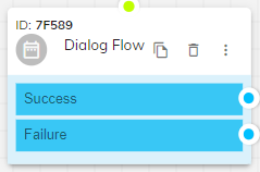
Dialog Flow Component
- What it does: Checks whether a predefined conversational “goal” has been met (1) or not (0).Checks whether a predefined conversational “goal” has been met (1) or not (0).
- Use Case: A goal could be “user provided valid email,” so the flow branches accordingly.
The Dialog Flow component asks the user to check the intent of the flow. The goal refers to the specific rules which the chatbot is supposed to meet during its flow. If the user completes the goal, it is represented as 1, and if not, it is represented as 0. It is possible in a chatbot that you didn’t set any goal. You can edit the components by clicking on the ⋮ icon on the component window
-
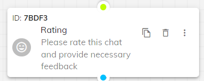
Rating Component
- What it does: Captures user satisfaction via stars, smileys, etc.
- Use Case: Post‑chat feedback: “Rate your support experience.”
The Rating component asks the end user for a rating. There are various customizations available in the form of smileys, stars, etc. The rating is generally out of 5. You can change the direction of the flow according to the rating. This is very useful when surveying any product or service in the chatbot flow itself.
-
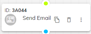
Send Email Component
- What it does: Sends an email mid‑conversation, with customizable recipient, subject, body, and attachments.
- Use Case: After a checkout flow, email the receipt automatically.
The Send Email component helps you in sending emails. If you want to send a separate email to your user while he/she is interacting with your chatbot, you can use this component. The email id needs to be entered from the back end, but you can customise whom to send the mail to, the subject of the email, and the content. There’s also an option to enclose an image or media into your chatbot. These options can be accessible by clicking on the ⋮ icon on the component window.
-
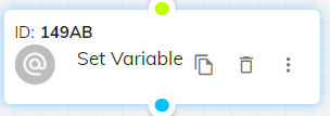
Set Variable Component
- What it does: Stores any value (text or numeric) as a variable for later reference.
- Use Case: Save the user’s loyalty tier to personalize future messages.
The Set Variable component helps to store the data in a variable. This is used to set any type of data we get from the user, whether it's a character, numeric, or a mix of both, you can save it in the form of a variable so that you may call it later when needed during the flow of the chatbot.
-
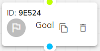
Goal Component
- What it does: Defines measurable campaign goals (e.g., lead captured, appointment booked) to track bot effectiveness.
- Use Case: Measuring conversion rates within a single conversational flow.
The Goal component helps in achieving goals. A chatbot goal is a specific, measurable, aspirational, realistic, and time-bound metric that drives every aspect of a chatbot. As a chatbot developer, your job is to define these goals. It's a benchmark against which you’ll measure your chatbot efficiency.
-
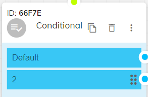
Conditional Component
- What it does: Implements if‑then logic and AND/OR operators to branch flows dynamically.
- Use Case: If the user’s cart value exceeds $100, offer a free shipping prompt; otherwise, proceed normally.
The Conditional component helps in adding conditions. Using conditions, you can interlink dialogs based on a set of rules or logic to solve your use case in the bot builder. The Conditions tab under a dialog’s setting allows you to do this and more. You can set up multiple conditions for one dialog to connect to another at any point in the flow and redirection based on customer input.
With the ability to set up If - else conditions and AND - OR operators in the conditional flow extensively, you can tighten your chatbot flow and tailor it to suit your business requirement.
-
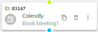
Calendly Component
- What they do: Integrate directly with Calendly or Google Calendar APIs to let users schedule real meetings without leaving chat.
- Use Case: Sales teams eliminating back‑and‑forth emails to find a meeting slot.
The Calendly component helps to choose appointments from the calendar. Calendly is one of the most commonly used tools when it comes to scheduling customer/sales meetings. Over time, it’s been one of our most frequently requested integrations on ChatGen, so it was pretty much on top of our priority list.
Finally, the Calendly integration is here and it’s set to make your sales cycle a lot smoother. Instead of a complicated back-and-forth over email, you can now directly ask users to schedule Calendly meetings on the chat widget.
-
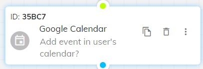
Google Calendar Component
- What they do: Integrate directly with Calendly or Google Calendar APIs to let users schedule real meetings without leaving chat.
- Use Case: Sales teams eliminating back‑and‑forth emails to find a meeting slot.
The Google Calendar component helps the end user choose the appointments from the google calendar.
You can add an event link from Google and other calendars to Chat360 chatbot so that users can add your events to their calendars.
For example, when booking a table in a restaurant or announcements of various events — webinars, master classes, or starting a promotion in a store. The settings can be customised by clicking on the ⋮ icon on the component window.
-
Google Sheets Component
- Sheets: Read/write rows to a spreadsheet (e.g. log leads, retrieve product info).
- Gmail: Send emails from a configured Gmail account.
- Use Case: Automated lead‑data export to Google Sheets, or sending confirmation emails via Gmail.
The Google Sheets component helps the user in receiving the data from google sheets. Spreadsheet integration allows you to export chatbot data to a spreadsheet hosted on the Google Sheets platform, or retrieve the data from a specific sheet row.
This feature can be used in hundreds of use cases whenever you need to save the chatbot-generated data outside of the bot, including:
1. Loyalty campaigns
2. Lead generation
3. Retrieving product, prices, description, and features
4. Making table reservations in restaurants and bars
5. Retrieving user’s shipment information
-
Gmail Component
- Sheets: Read/write rows to a spreadsheet (e.g. log leads, retrieve product info).
- Gmail: Send emails from a configured Gmail account.
- Use Case: Automated lead‑data export to Google Sheets, or sending confirmation emails via Gmail.
The Gmail component helps in sending emails from the business Gmail account to the end user. You need to integrate your Gmail Account with this component and decide on the subject and the body of the mail in advance while constructing your chatbot. This, too, supports all kinds of media to be attached to your chatbot.
-
Payment Integration Component
- Integrate with multiple payment gateways to support various payment methods.
- Customise the payment flow to ensure a smooth and user-friendly experience.
- Securely capture and process payment information, ensuring compliance with relevant security standards.
The Payment Integration component enables seamless payment processing within your chatbot, allowing users to complete transactions directly through the chat interface. This component supports various payment methods and gateways, ensuring a secure and efficient payment experience. Whether it's for purchasing products, booking services, or any other payment-related interactions, the Payment Integration component simplifies the transaction process for users.
Usage: Facilitate secure and efficient payment processing.
Customization:
What it does: Processes payments in‑chat via your choice of gateways.
Use Case: Completing in‑bot purchases—ticketing, product orders, or donations—through secure, embedded checkout.
-
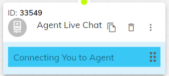
Agent Live Chat Component
- What they do: Escalate from bot to a human agent or team queue seamlessly.
- Use Case: When a user types “agent,” the conversation transfers to an available CSR.
The Agent Live Chat component helps in transferring the room to the live agent. Live chat offers human-to-human communication and adds empathy to support conversations, while chatbots elevate the support experience by providing instant answers and automating responses to support queries. Live chat and chatbots work together to provide a high-quality customer support experience to your customer.
The Agent Live chat can also be used in place of the “End flow” component because the Agent can resolve/ abandon the chat once they solve the requirements of the end-user.
-
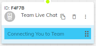
Team Live Chat Component
The Team Live Chat component offers human-to-human communication and adds empathy to support conversations, it is like Agent live chat component but unlike the agent live chat, it assigns the chat to a team of agents where the team manager can then personally assign the chat to any desired agent or the team live chat component assigns the chat to any random agent in the team.
-
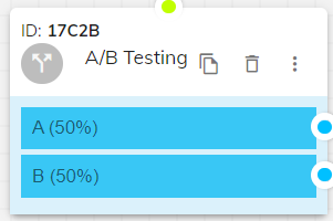
A/B Testing Component
One way of optimizing digital experiences is A/B testing. The A/B testing component allows you to create two (or more) variants for your users. This way of testing is used a lot when optimizing websites. You create variants, select a metric and measure which of these variants has the highest conversion.
This concept is compelling and can also be used in conversational experiences. Our A/B testing feature for your chatbot allows you to easily create variants of specific parts of your everyday experience.
-
Webhook Component
- URL or the API in the Webhook URL field.
- Mention/Set the timeout for the API in the Timeout field.
- Set the API Request type (GET/POST/PUT/DELETE) in the Request method field.
- Enter the body of the API in the Customise body field.
- Enter the response that will be captured in the Capture response field.
- If you have to enter any authorization tokens or specify the content type, use the Customise header field.
- Enter the response status code in the ADD STATUS FIELD.
Webhook component is used to integrate APIs in the bot, by using this component, we can PULL or PUSH the data generated through the bot into client’s CRM or external softwares.
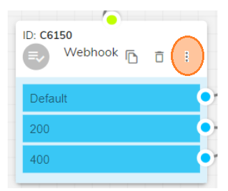
To use it, click on the three dots on the component window, to edit the component.
This will give you a pop-up where you have to fill in the details of the API, when the bot flow will intercept the component, the mentioned API will get triggered, for these you need to add
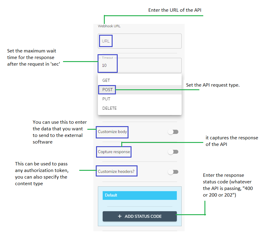
Capture Response: When you turn on the toggle of “Capture response”, to enter the response of your API, you can select the response type if it is “Single Object” or “List” by interacting with the drop down.
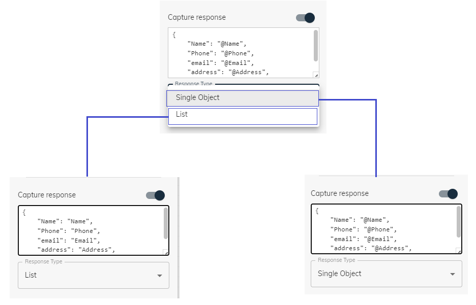
If the response type is “List”, you must enter the Key-Value pair in a specific format Eg: “Key”:”Value”
If the response type is “Single Object”, you must enter the Key-Value pair in a specific format Eg: “Key”:”@Value”
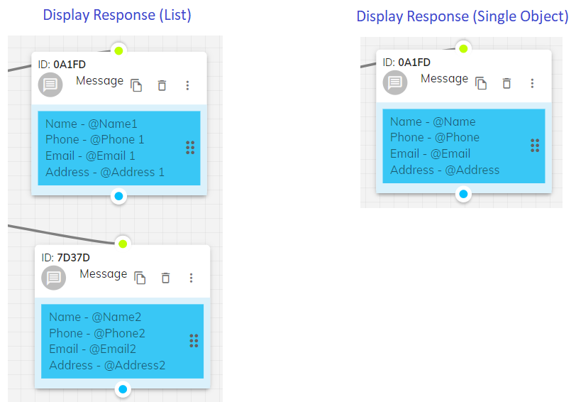
When displaying the response, for list and single object, you must enter the values according to the format mentioned in the image below
-
End the Flow Component
- Access Customization: Click the ⋮ icon on the component.
- Concluding Message: Set a final message to thank or inform users, ensuring they know the interaction is complete
- Redirection: Optionally, redirect users to another page or action.
- Smooth Conclusion: Ensure the conversation ends smoothly, leaving users with a positive impression.
The End the Flow component terminates the interaction flow, providing a clear conclusion to the user’s experience.
Usage: Conclude the user interaction.
Customization:
-
Industry‑Level Example
- Component Blockfor “Troubleshooting SIM Activation.”
- Phone + Custom Input to capture user’s number and issue details.
- Conditional Componentto branch based on “SIM not found” vs. “Service low speed.”
- Locate Me to suggest nearest service center.
- Ticket Component if the problem persists, automatically creating a service ticket.
- Agent Live Chatto transfer to a live rep if the user says “talk to agent.”
- Rating Component at the end to capture satisfaction.
A telecom provider’s support bot might use: