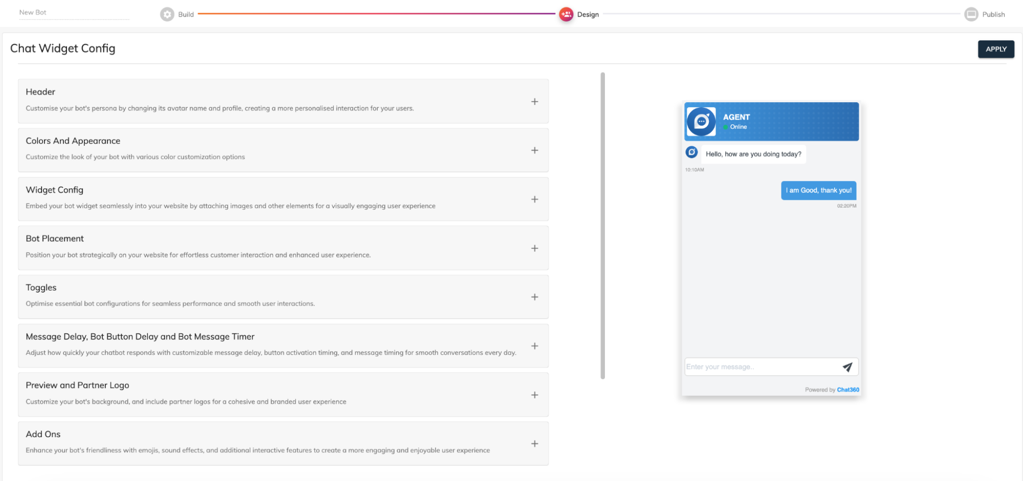
Designing your bot
-
1. Header Customization
-
Operator Photo & Name
- Upload Profile Image: Use a square PNG or JPG to display a clear operator avatar or brand logo.
- Display Name: Set a human‑friendly name (e.g., “SupportBot by Acme Inc.”) to immediately convey who or what users are chatting with.
-
Text Styling & Status Indicators
- Text Color & Font Size: Control contrast and readability by selecting from the full color picker and adjusting font size between 12 px–24 px.
- Online/Offline Toggle: Show a live status badge (green for online, gray for offline) to inform users if the bot or live agent is currently available.
- Subtitle Line: Optionally add a tagline beneath the name (e.g., “Here to help 24/7”) for clarity on service hours.
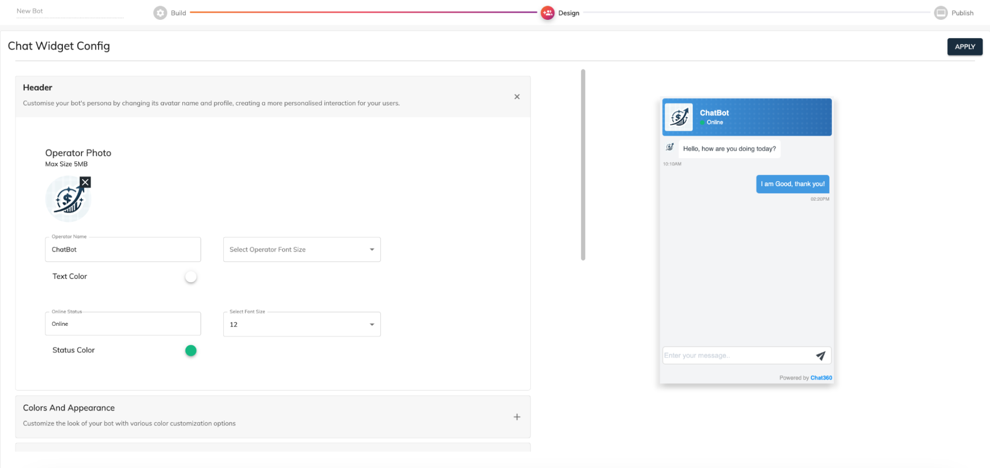
Why it matters: A well‑configured header builds instant trust, sets user expectations, and reinforces brand consistency at the very start of every conversation.
-
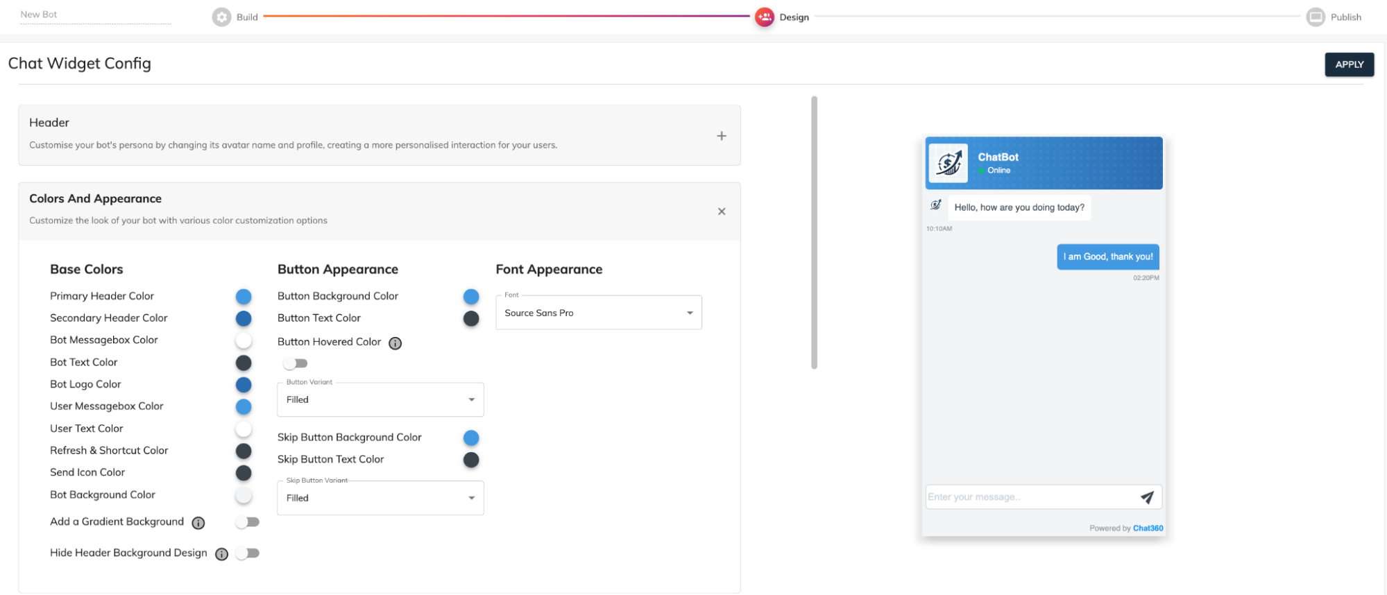
2. Colour and Appearance :
-
Site‑Wide Color Palette
- Primary & Secondary Header Colors: Define two complementary colors for the header bar and accent borders; ideal for matching corporate branding guidelines.
- Bot & User Message Boxes: Assign distinct background shades for bot messages (e.g., light gray) and user messages (e.g., soft blue) to visually separate dialogue.
- Text Colors: Ensure optimal legibility by selecting contrasting text colors for both bot and user bubbles.
-
Iconography & Interactive Elements
- Logo & Widget Icon Colors: Tint your bot’s logo and launcher icon to align with theme colors, reinforcing brand identity even when the chat is minimized
- Refresh & Shortcut Icons: Customize the color of in‑chat utility icons (refresh, help, shortcut menu) for visual cohesion.
- Send Button & Spinner: Set the fill and border colors for the “Send” button and typing indicator spinner, emphasizing call‑to‑action status.
-
Background & Overlay
- Chat Window Background: Optionally apply a subtle pattern or solid color behind the conversation pane to improve focus on message content.
- Overlay Opacity: When the chat widget expands, control the opacity of the page overlay to guide the user’s attention to the chat interface.
Why it matters: A cohesive color scheme elevates brand recognition, guides user focus, and reduces cognitive load—making conversations feel intuitive and on‑brand.
-
3. Button Appearance:
-
Core Button Styles
- Background Color & Gradient Options: Choose flat or gradient backgrounds for quick‑reply buttons, primary CTAs, and link buttons, ensuring they stand out in the flow.
- Text Color & Typography: Match font family and text color to brand standards; adjust letter spacing for readability on both desktop and mobile.
- Hover & Active States: Define hover colors and pressed states to provide tactile feedback, reinforcing button interactivity.
-
Advanced Styling
- Border Radius & Shadows: Apply rounded corners (0 px–50 px) or soft shadows to create depth, making buttons appear more clickable.
- Icon Integration: Prepend or append custom icons to button labels (e.g., a phone icon for “Call Us”), improving visual cues for users.
Why it matters: Well‑styled buttons not only look attractive but also drive higher click‑through rates by clearly communicating interactive elements and enhancing usability.
-
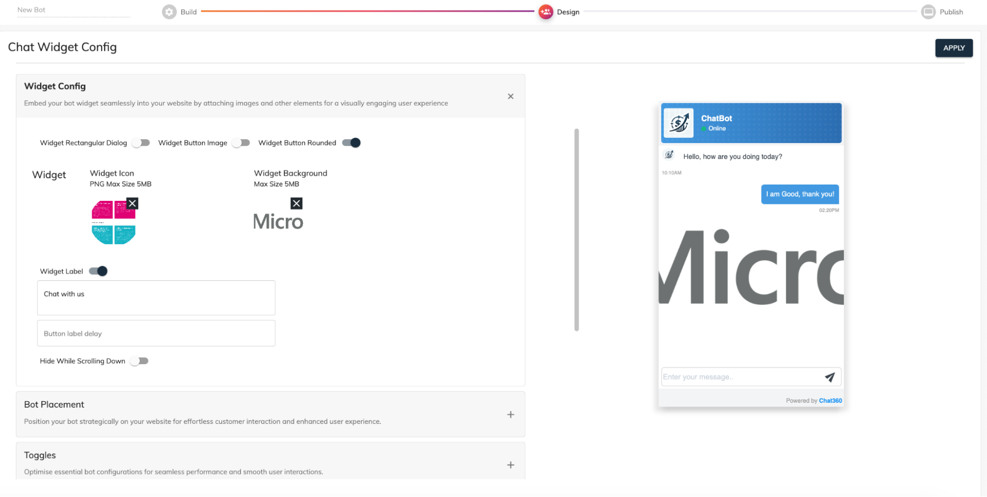
4. Chat Widget Configuration:
-
Launcher & Label Settings
- Widget Icon Upload: Add a high‑resolution (PNG, 5 MB max) icon that reflects your brand’s mascot, logo, or support emblem.
- Background Image: Use a full‑color JPG/PNG (5 MB max) for the widget frame to create a visually distinctive launcher on your site.
- Label Text & Delay: Custom‑write your call‑to‑action (e.g., “Need Help? Chat Now!”) and set a timed delay (0–10 seconds) before it appears, balancing engagement with non‑intrusiveness.
-
Behavioral Toggles
- Hide on Scroll Down: Automatically collapse the widget when the user scrolls down past a threshold, preserving screen real estate for content exploration.
- Auto‑Open Conditions: Optionally open the chat window after a defined time on site (e.g., 15 seconds) or when a user visits specific pages (e.g., pricing, checkout).
- Compact vs. Expanded Modes: Choose whether the widget starts as a minimized icon or an expanded banner, depending on your conversion goals.
-
Positioning & Spacing
- Side Placement: Pin the widget to the left or right side of the viewport.
- Offset Controls: Precisely set the distance (in pixels) from the bottom and side edges to avoid overlapping fixed page elements like footers or cookie banners.
- Responsive Behavior: Configure separate offsets for mobile and desktop breakpoints to maintain accessibility across device types.
Why it matters: Thoughtful widget configuration ensures your chat invitation is both prominent and harmonious with your page layout—maximizing user engagement without disrupting the browsing experience.
-
Putting It All Together
- Reflects Your Brand: From header logos to accent colors, ensure every pixel aligns with your corporate identity.
- Elevates Usability: Intuitive buttons, clear typography, and interactive states guide users seamlessly through conversations.
- Optimizes Engagement: Behavioral triggers and strategic widget placement increase chat adoption without annoying site visitors.
- Maintains Consistency: Channel‑specific overrides let you fine‑tune the experience on WhatsApp, web chat, or voice—while keeping core design elements unified.
By leveraging every setting in the Design Your Bot Interface module, you can craft a chat experience that: